Interview
Quebec City’s summer music festival: Commemorative posters for the 50th edition
Fred Jourdain / Martin Parrot
On top of the bass you made for the Red Hot Chili Peppers in 2016, the festival also asked you to make posters to mark its 50th anniversary. How did that happen?
In January of 2017, I was called in for a meeting with Louis Bellavance, the festival’s line-up director. Two years earlier, he and I had actually discussed creating a poster for the festival’s 50th, but it didn’t go any further than that. However, after I produced the bass for Flea, in July of 2016, Louis convinced the board to give me the mandate to create something for the festival’s 50th.


So I proposed a simple idea: let’s not promote bands or the city’s architecture or the festival’s stages. Instead, let’s create a collector’s item, a souvenir for festival-goers, something artistic and simple. With a strong brand, you can create a sense of belonging. The festival has a personality, but it doesn’t express itself visually through its posters and ads.
I had a pretty clear idea of what I didn’t want but I knew I wanted something out of the ordinary. I wanted to mark the festival’s history and it’s mythical character. Louis liked my approach so I went in that direction. I drew a pile of sketches and went back to see him a few weeks later.
I had some promising leads but the ones I liked the most revolved around the concept of modernity and the past - a time that’s come and gone but hasn’t yet disappeared.
I wanted to evoke the historical nature of the Plains of Abraham and the massive shows that taken place there while at the same time adding a funky vibe, as if a portal had opened up in between two eras.
How did you decide which concept to go with?
The festival isn’t just about rock, blues, pop or world music. It offers a lot of different styles and it’s a challenge to synthesize that into a single image. I didn’t want to draw something that would remind people of one band or one style.
I made lots of sketches using a bunch of ideas and went down several avenues. One of my concepts brought together three characters, sort of musical deities if you will. I had an Art Nouveau inspiration for that illustration. After that, I played around with the idea of giants that emerge from the past to come and see shows at the festival.
The creative process went well but the board wasn’t sure about my concepts so they asked me to make three posters, one for each of the festival’s main stages. I wasn’t sure about this new directive but I went along with it and worked for several weeks on a variety of concepts. I tried playing around with some historical elements that could blend well with the frenzy of the concerts.
One of the ideas I liked was about the Battle of the Plains of Abraham. I wanted to show a young and modern crowd running onto the plains to make it the front of the stage with French and British soldiers peppered in amongst them. Louis liked the concept but the board didn’t. By then, there were three weeks left before the start of the festival and I still hadn’t gotten a green light to start drawing. That’s when I gave them an ultimatum: I had to begin my final illustrations if we wanted to print the thousands of posters necessary in time for opening day.
Ultimately, they decided to give me free rein and I took my three ideas and finalized my illustrations. They ended up liking them and it was pretty unanimous. Two of my images were chosen and they became the face of the festival’s 50th.
What were the two illustrations?
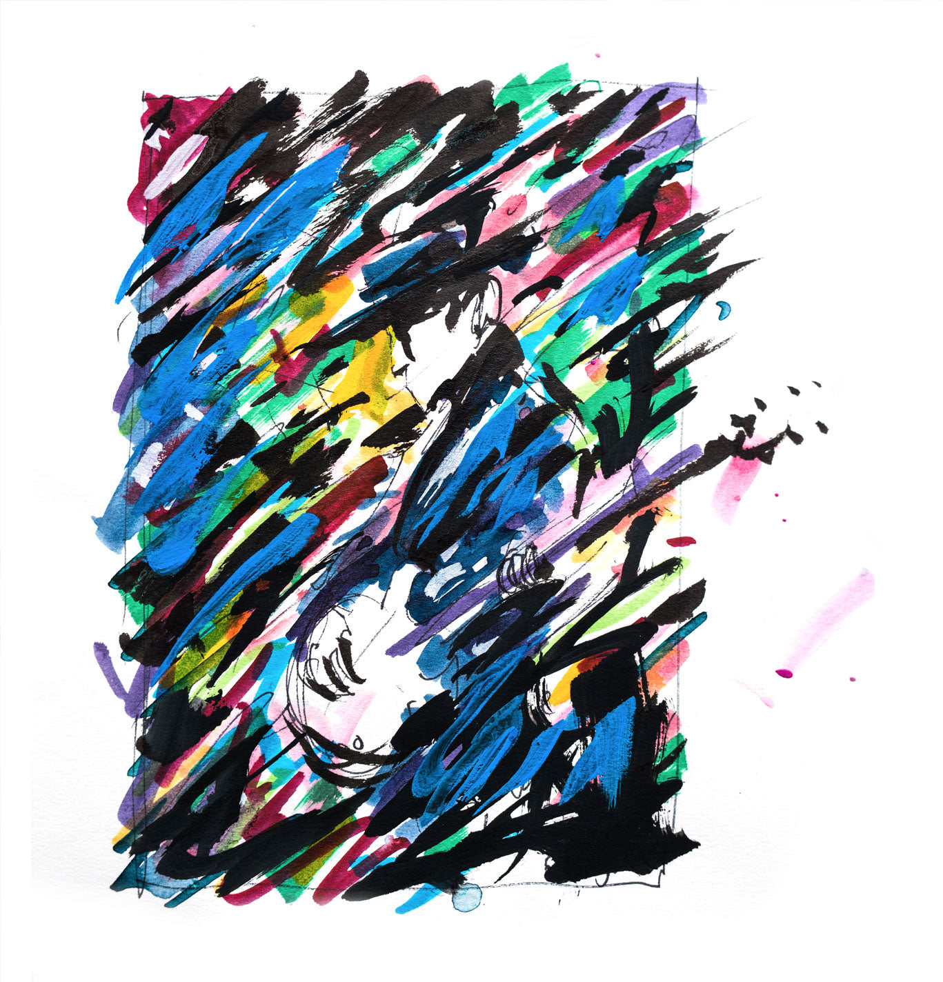
The first poster is a classic image of a musician, one that doesn’t denote a particular style and that can blend in with any kind of music. It’s a nice illustration and I played it safe with that one. I told myself that if the board didn’t like the other ones, - you know, the more psychedelic ones - then they’d approve this image. I even integrated the city’s skyline and it worked out pretty well in the end!
The second illustration is a little more eccentric. Honestly, I took a risk and I didn’t think the board would like it. I called it “On the shoulders of Giants” and it reflects some of my original ideas. For example, how the vibe of the music awakens the past, and how these giant figures from the past come and enjoy the show. It turns out it was their favourite so I’m I’m glad I went ahead and dared myself to show it.
The festival decided not to go ahead with my third poster. It was more representative of musical styles that have always been present at the festival, like world music, jazz and blues. I liked it though, so I reworked it and kept it as part of my personal collection.
credits
Photos: Anthony Jourdain, Catherine Côté, Fred Jourdain, Martin Poulin, Martin Côté
Translation from french : Peter Tardif
Share this
© Affranchi - The contents of this publication may not be reproduced without the author's consent
interview
Quebec City’s summer music festival: Commemorative posters for the 50th edition
Fred Jourdain / Martin Parrot
On top of the bass you made for the Red Hot Chili Peppers in 2016, the festival also asked you to make posters to mark its 50th anniversary. How did that happen?
In January of 2017, I was called in for a meeting with Louis Bellavance, the festival’s line-up director. Two years earlier, he and I had actually discussed creating a poster for the festival’s 50th, but it didn’t go any further than that. However, after I produced the bass for Flea, in July of 2016, Louis convinced the board to give me the mandate to create something for the festival’s 50th.


So I proposed a simple idea: let’s not promote bands or the city’s architecture or the festival’s stages. Instead, let’s create a collector’s item, a souvenir for festival-goers, something artistic and simple. With a strong brand, you can create a sense of belonging. The festival has a personality, but it doesn’t express itself visually through its posters and ads.
I had a pretty clear idea of what I didn’t want but I knew I wanted something out of the ordinary. I wanted to mark the festival’s history and it’s mythical character. Louis liked my approach so I went in that direction. I drew a pile of sketches and went back to see him a few weeks later.
I had some promising leads but the ones I liked the most revolved around the concept of modernity and the past - a time that’s come and gone but hasn’t yet disappeared.
I wanted to evoke the historical nature of the Plains of Abraham and the massive shows that taken place there while at the same time adding a funky vibe, as if a portal had opened up in between two eras.


How did you decide which concept to go with?
The festival isn’t just about rock, blues, pop or world music. It offers a lot of different styles and it’s a challenge to synthesize that into a single image. I didn’t want to draw something that would remind people of one band or one style.
I made lots of sketches using a bunch of ideas and went down several avenues. One of my concepts brought together three characters, sort of musical deities if you will. I had an Art Nouveau inspiration for that illustration. After that, I played around with the idea of giants that emerge from the past to come and see shows at the festival.
The creative process went well but the board wasn’t sure about my concepts so they asked me to make three posters, one for each of the festival’s main stages. I wasn’t sure about this new directive but I went along with it and worked for several weeks on a variety of concepts. I tried playing around with some historical elements that could blend well with the frenzy of the concerts.
One of the ideas I liked was about the Battle of the Plains of Abraham. I wanted to show a young and modern crowd running onto the plains to make it the front of the stage with French and British soldiers peppered in amongst them. Louis liked the concept but the board didn’t. By then, there were three weeks left before the start of the festival and I still hadn’t gotten a green light to start drawing. That’s when I gave them an ultimatum: I had to begin my final illustrations if we wanted to print the thousands of posters necessary in time for opening day.
Ultimately, they decided to give me free rein and I took my three ideas and finalized my illustrations.
They ended up liking them and it was pretty unanimous. Two of my images were chosen and they became the face of the festival’s 50th.
What were the two illustrations?
The first poster is a classic image of a musician, one that doesn’t denote a particular style and that can blend in with any kind of music. It’s a nice illustration and I played it safe with that one. I told myself that if the board didn’t like the other ones, - you know, the more psychedelic ones - then they’d approve this image. I even integrated the city’s skyline and it worked out pretty well in the end!
The second illustration is a little more eccentric. Honestly, I took a risk and I didn’t think the board would like it.
I called it “On the shoulders of Giants” and it reflects some of my original ideas. For example, how the vibe of the music awakens the past, and how these giant figures from the past come and enjoy the show. It turns out it was their favourite so I’m I’m glad I went ahead and dared myself to show it.


The festival decided not to go ahead with my third poster. It was more representative of musical styles that have always been present at the festival, like world music, jazz and blues. I liked it though, so I reworked it and kept it as part of my personal collection.
credits
Photos: Anthony Jourdain, Catherine Côté, Fred Jourdain, Martin Poulin, Martin Côté
Translation from french : Peter Tardif
Share this
© Affranchi - The contents of this publication may not be reproduced without the author's consent